position: sticky
Alternatively, the sticky option keeps the element in flow with the other elements. As you scroll the page, the element will stay in its normal spot until it is a certain distance from the top of its containing element (after which it will stick to a place).
To build upon the example from the previous exercise, suppose we make the “About” and “Project” sections 100vh tall (giving more scrolling room), select the h2 elements within each section, and set their position to sticky
div {
  height: 100vh;
}

h2 {
  position: sticky;
  top: 0;
}
By setting the top of the h2 with the sticky position, and because the page body is its nearest scrolling container, each heading gets “stuck” to the top of the screen until we’ve scrolled past its most direct container div element.
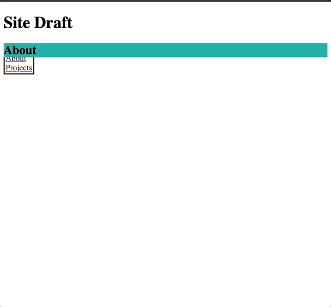
Like with relative and absolute, a common side-effect of using the fixed and sticky positions is the rendered elements may not appear right while scrolling through the page.
In the last example, our unordered list with the fixed position is now appearing behind the sticky “About” and “Project” headers.
This happens for two reasons:
- The unordered list has a
fixedposition and is taken out of flow with the rest of the elements (including thestickyheaders). - The HTML for our
fixedelement is written before the HTML for ourstickyelement(s).
Let’s fix this with the z-index property!
ul {
  background-color: lightyellow;
  border: 2px solid;
  padding: 2px;
  list-style-type: none;
  position: fixed;
  z-index: 1;
}
This will render the following:
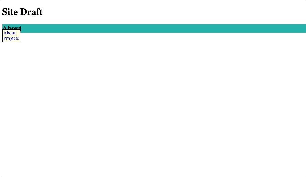
We placed the ul element behind the section h2 headers with the z-index property. Pretty nifty!