position: relative
Next, let’s explore relative!
The relative position allows your element to be “moved” around the screen, away from where it would normally be on the screen.
When we set an element’s position property to anything but static, it can be moved with the top, right, bottom, and left properties. This includes relative.
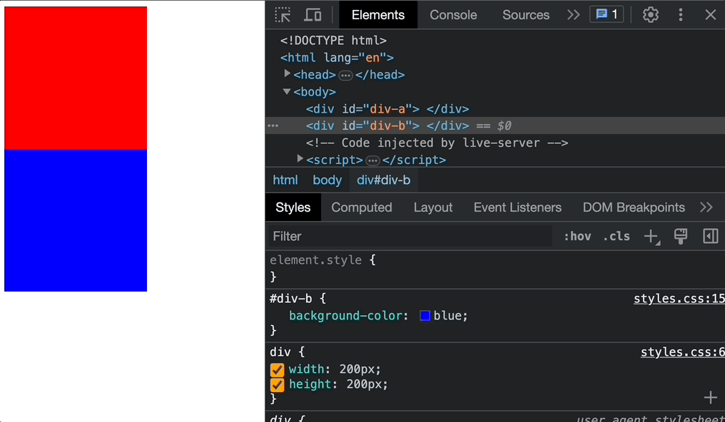
Remember the red and blue <div> examples from the previous exercise? Here is the CSS code for it:
div {
  width: 200px;
  height: 200px;
}

#div-a {
  background-color: red;
}

#div-b {
  background-color: blue;
}
We can break #div-b out of the normal flow by changing its position to relative, and then move it from the left and top sides by 25px:
#div-b {
  background-color: blue;
  position: relative;
  left: 25px;
  top: 25px;
}
The top and left properties can also be set with relative units like 5em and 50%.
Note: Keep in mind that top moves an element down the screen, right moves it to the left, bottom moves it up, and left moves it right. Imagine something is pushing the element box from that side (i.e., push the element 25px to the right from the left side).
z-index
If you work with position: relative long enough, you’ll notice how some elements will overlap other elements.
When you don’t want this, try using the z-index property! This changes the way elements are “layered” on the site, regardless of when they appear on the HTML file. It’s like magic! 🪄
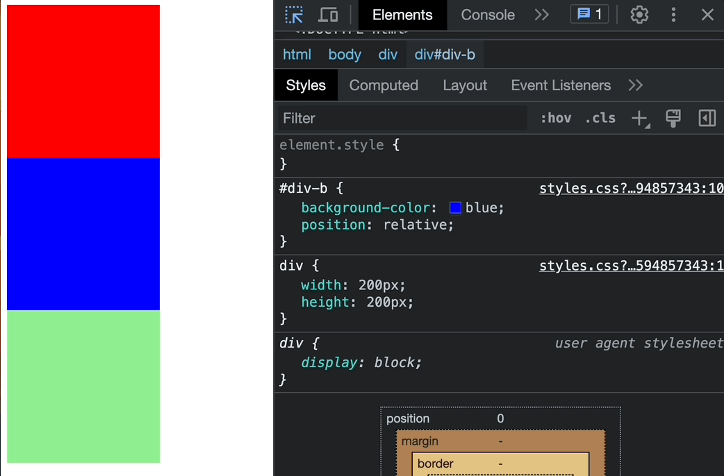
Let’s revisit the example with the two <div> elements and demo z-index by adding one more #div-c element:
div {
  width: 200px;
  height: 200px;
}

#div-a {
  background-color: red;
}

#div-b {
  background-color: blue;
  position: relative;
  left: 25px;
  bottom: 25px;
  z-index: -1;
}

#div-c {
  background-color: lightgreen;
}
This renders something like the following: