CSS Fonts
Fonts are one of the most heavily-used properties for styling. They can improve readability and further express a page’s tone and feeling.
In CSS, there are five generic font families:
- Serif
- Sans-serif
- Monospace
- Cursive
- Fantasy
These fonts are considered to be “web-safe” because they are supported in most major web browsers. Below is a table that showcases each family, along with a few examples:
| Font Family | Characteristics | Examples |
|---|---|---|
| Serif | Small decorative strokes added to the ends of letters, often used for printed materials because they are more legible. | - Georgia - Times New Roman - Baskerville |
| Sans-serif | No strokes at the ends of letters, often used in digital media and advertising for a modern and professional look. | - Arial - Helvetica Neue - Open Sans |
| Monospace | Each character takes up the same amount of horizontal space, often used for computer programming. | - Consolas - Courier New - Lucida Console |
| Cursive | Has a hand-written appearance, often used for printed materials that convey a personal touch. | - Brush Script MT - Lobster - Dancing Script |
| Fantasy | Highly stylized or decorative letter forms, often used to add personality and flair to a design or display. | - Impact - Chiller - Jokerman |
To assign these families with CSS, we use the font-family property:
p {
  font-family: Arial, sans-serif;
}
NOTE
Note: Why did that example include an additional font,
sans-serif, at the end? It is good practice to always include a general font name after the desired font name. This way, the browser can fall back to something if need be.
Font Properties
Besides font-family, there are other CSS properties we can use to style our fonts.
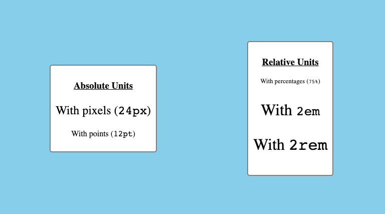
The font-size property sets how big the text of a given element should be on the page. It can either be done with absolute units (px, pt, etc.) or relative units (percentages, em, rem, etc.)
This property can be applied to any element that features text content, such as paragraphs:
/* With Absolute Units */
p {
  font-size: 12px;
}

/* With Relative Units */
p {
  font-size: 12em;
}
The following image showcases a few more examples of using the font-size property:
Note: The font-size property should be applied in an accessible way. This means avoiding absolute units when possible and not making paragraph text as large as header text (or vice versa).
We can also use the font-weight property to set the default “thickness” of a given element’s text.
This property uses either keyword values (e.g., lighter and bolder), or numeric values (e.g., 100 and 800):
p {
  font-weight: 800;
}
If we use numeric values for the font-weight property, keep the following in mind:
- Anything less than
400makes the font thinner or lighter. - The
400-700range is considered “normal” for most fonts. - Anything above
700usually makes the font bolder.
Note:
Despite these ranges, not all font families are affected the same way by the
font-weightproperty. For example, if a given font is already bold to begin with, an increasedfont-weightmight have little to no effect.